Foothills of Bayesian Analysis
A recent news story was about doctors not knowing the basics of Bayes’ theorem: they were asked a basic question about false results on a disease test. A lot of them flubbed it.
Let’s be fair: I wouldn’t expect most doctors to be able to regurgitate Bayes law or do an applied example.
I would expect them to say “That question is more complex than it sounds”, rather than fall into the usual trap.
It’s the old knowing what you don’t know (and that’s for another post).
Anyway, that was the prod for me do a dive into basics of Bayesian Analysis in several parts.
I’m a fan of using diagrams for understanding something and encouraging insights, so we’ll look at some simple visualistion here: Bayes hourglass and frequency strips.1
Justify your love
Why are stats and Bayesian Probability useful?
Because they can give you a more accurate understanding of the world, which allows you to make better decisions.3
Care around language
There’s a few linguistic traps to watch out for.
Bayes theorem deals with conditional or dependent probabilities of two events A and B. It doesn’t say anything about causation though; only about correlation.
The word dependent here is shorthand for statistically dependent.
‘Dependent’ can mean correlation (A, B tend to happen together) or inverse correlation (A, B tend to not happen together).4
There’s a higher probability of me taking an umbrella outdoors on days it’s raining.
That’s not saying the rain caused me to take an umbrella (or the opposite!). It might be that there is a causal link there. But the probability stuff isn’t saying anything about that; it’s just noticing a correlation.
And two correlated events might be related to some known or unknown event further ‘upstream’: your dog howling, and it raining, might be correlated because they’re both correlated with low air pressure above your house.
These sorts of networks are where Bayesian Analysis (BA) comes in, answering questions like “What are the fundamental correlations here? What is secondary?” And BA moves us on from the concept of “independent of” to “independent of, with respect to”.
Bayes theorem
There’s various different ways of stating Bayes. Rather than remember the main equation, I find it easier to bootstrap my understanding with an equation that is intuitive:
\[ \mathrm{P}(A \cap B) = \mathrm{P}(A) \: \mathrm{P}(B \mid A) \label{eq:bayes1} \]In words: the probability of A and B happening is found by multiplying together:
- probability of A happening
- probability of B happening given A has happened
With this intuitive bit I can derive everything else, because I know the symmetry of intersection (\( \cap \)): \(\mathrm{P}(A \cap B) = \mathrm{P}(B \cap A)\)5. So by substituting in eqn \eqref{eq:bayes1} on both sides of the symmetry:
\[ \mathrm{P}(A) \: \mathrm{P}(B \mid A) = \mathrm{P}(B) \: \mathrm{P}(A \mid B) \label{eq:bayes2} \]and then we can re-arrange this a few ways:
\[ \mathrm{P}(A \mid B) = \frac{\mathrm{P}(B \mid A) \; \mathrm{P}(A)}{\mathrm{P}(B)} \label{eq:bayes3} \]Eqn \eqref{eq:bayes2} also re-arranges to this quite memorable form, the ratio equation:
\[ \frac{\mathrm{P}(A)}{\mathrm{P}(B)} = \frac{ \mathrm{P}(A \mid B) }{ \mathrm{P}(B \mid A) } \label{eq:bayes4} \](More on the ratio equation later.)
Make with the pictures
I’d like to leven the splurge of equations with some pictures.
Below is the Bayes hourglass. It’s a picture of the five main terms in Bayes’ equations.
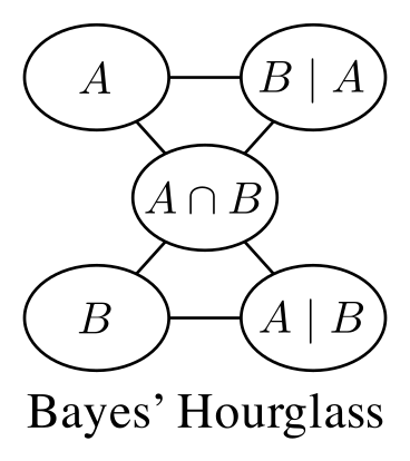
The picture doesn’t show the \(P(\cdots)\) around each term for the sake of clarity, but imagine it’s there.
The lines are showing where the strongest associations between the terms are. They form an hourglass shape.
Notice the symmetry between the top and bottom of the picture. And \(P(A \cap B)\) rightly sits bang in the middle: it’s the Queen of this little chessboard. It sits in the middle because \( \cap \) is commutative and hence has a symmetry none of the other terms has.5
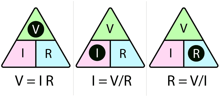
The lines of the hourglass form two triangles. These are useful triangles, because you can use them like the classic VIR triangle in electronics to quickly read equations (six variants) from the hourglass. Reminder of VIR:
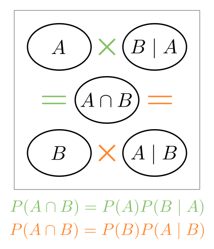
If we remove the lines and add some operators, we can visusalise how some variants of the Bayes equation hang together:
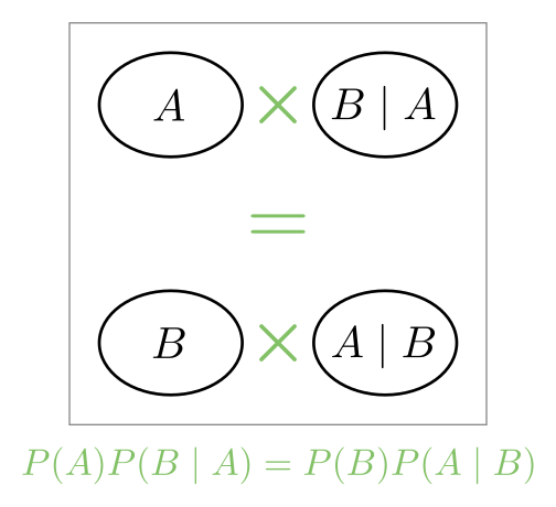
And a variation of the above is made by missing out the union in the middle and directly equating the top and bottom parts:
Finally, a picture showing the ratio equation (symmetry again):
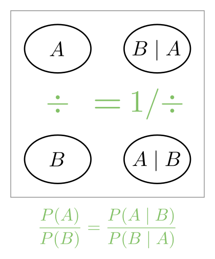
(The \(1 / \div\) means ‘reciprocal division’: turn the fraction upside down)
Frequency strips
The relative probabilities of A and B (and their overlap \(A \cap B\)) can be visualised with a frequency strip:6

There’s no labels on a frequency strip; the colours have a defined meaning, demonstrated here:
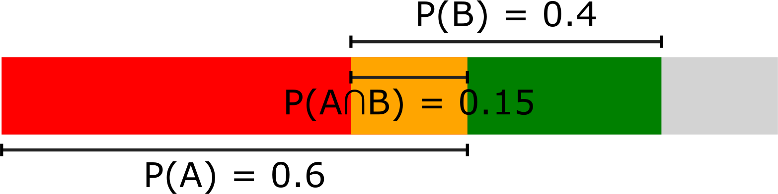
It’s the length of each colour relative to the entire bar that gives its probability (the entire bar represents probability 1).
The grey part is the ‘leftovers’: neither A or B.
The height of the bar has no meaning, by the way; it’s only lengths (x direction) that matter. And the absence of a particular bar corresponds to 0 probability.
Here’s some example frequency strips for different scenarios:
Frequency strip blocks
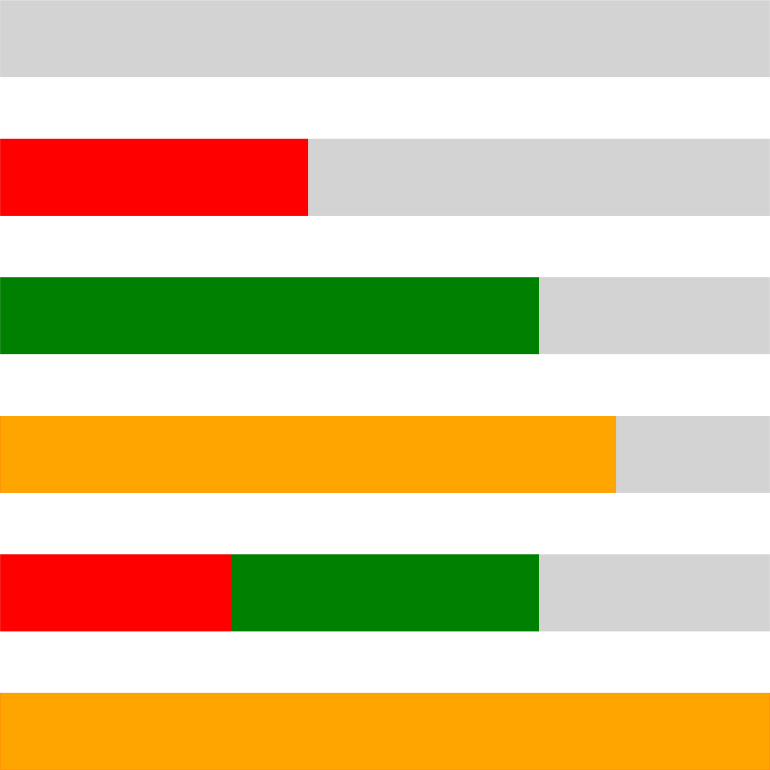
If we have multiple variables all dependent on A, we can glue frequency strips together to get an all-in-one comparison:

Here the single red block represents A.
Again, the vertical dimension doesn’t have any meaning, it’s all about comparing horizontal dimensions (probabilities).
What if we just know P(A) and P(B)?
If you have this limited information, there’s still a few things we can say. We know about things summing to 1:
$$ P(A) + P(B) - P(A \cap B) + P(\lnot A \cap \lnot B) = 1 \label{eq:sumToOne} $$We know all four parts on the left are between 0 and 1, therefore we can drop any of the four parts and make an inequality. Most notably:
$$ P(A) + P(B) - P(A \cap B) \le 1 $$And so we can place some bounds on the intersection and the exclusion:7
$$ \begin{aligned} \operatorname{max}(0, P(A) + P(B) - 1) &\le P(A \cap B) \le 1 \\ \operatorname{max}(0, 1 - P(A) - P(B)) &\le P(\lnot A \cap \lnot B) \le 1 \end{aligned} $$Afterword: Frequency strips, Venn diagrams and Karnaugh maps
Sometimes you see conditional probabilities shown on a Venn diagram like this:
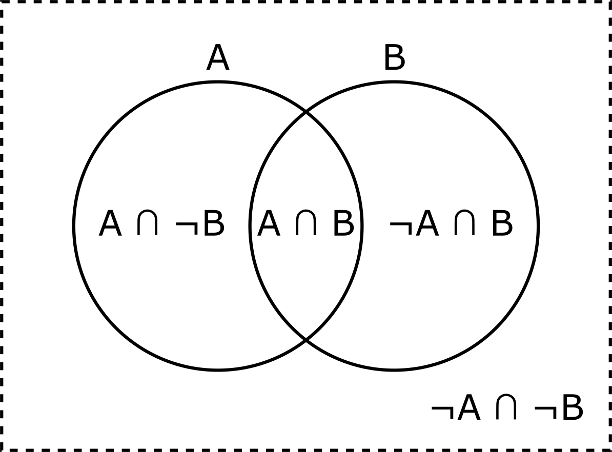
Venn diagrams are topological rather than quantitative: they’re good for showing concepts but not for showing proportions. But they are a close cousin of K-maps, which can show proportions (areas) accurately.
The frequency strips detailed earlier are just coloured K-maps.
And hence, you can slowly change the Venn diagram above into the K-map / frequency strip with a few steps:
Firstly, make the overlapping circles into overlapping squares.
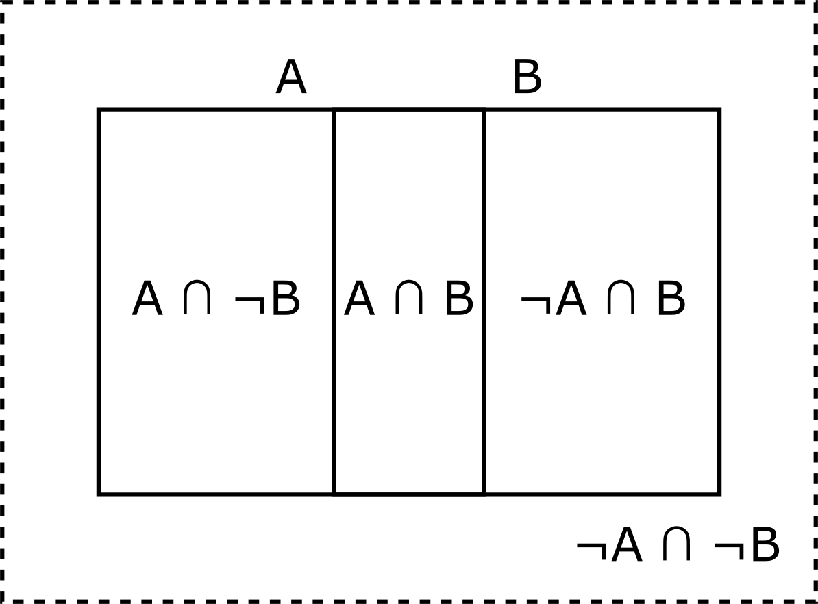
And then make the dotted outline into another box to the right of the diagram:
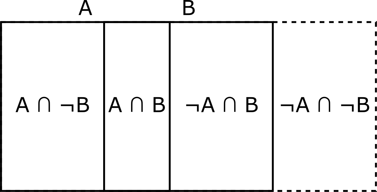
And now it’s a frequency strip, where the area/length of each section can be made proportional to the probability. Just add colour etc.
If you sum the widths (probabilities) of the four boxes you get 1, and that sum is a close variant of eqn \eqref{eq:sumToOne}.
designing a way of meaningfully diagramming something gives some good insights. For example, the frequency strips detailed in this post must be one-dimensional by the nature of what they are showing: dependent probabilities are in the same axis of probability ↩︎
I remember De Morgan’s as “negate the parts, swap the operator, negate the whole”. But how about a rhyming couplet?
“To flip a ‘not’ on AND/OR,
negate each part,
then swap the core.” ↩︎the word ‘better’ here is doing a lot of lifting, of course. Bayes is just as good at helping sell junk as it is improving healthcare outcomes! ↩︎
“tending to happen/not happen together” has some subtle details; we’ll revisit later ↩︎
\( \cap \) is commutative: it doesn’t matter what order \(A\) and \(B\) are written in ↩︎ ↩︎
the frequency strip idea is mine. I’m surprised that this obvious-seeming idea isn’t used elsewhere ↩︎
reminder: \(P(\lnot A \cap \lnot B) = P(\lnot (A \cup B))\). I think the former is nicer to read. And De Morgan’s law is your friend2 ↩︎